Neale Whitaker on creating your signature living space
Start with a blank canvas
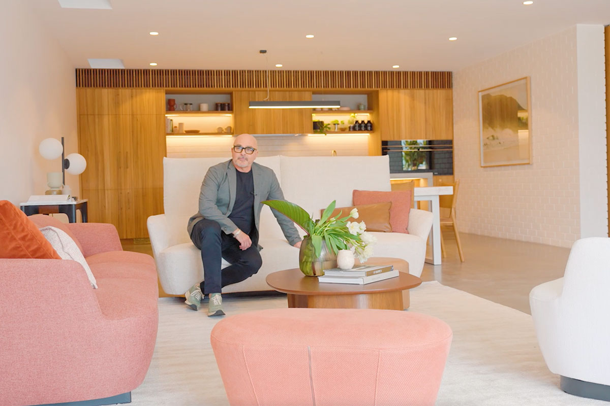
I like to think of a living space as an artist’s canvas, with deftly applied layers of colour and texture creating the finished work. And, as with a painting, if you start with a blank canvas, you’re free to take your style – and your imagination – in whichever direction you choose. When it comes to planning a living room, the one thing I’m asked most frequently is ‘where do I start?’ For me, that starting point will almost invariably mean considering the dimensions of the room, the height of the ceiling, the availability of natural light and position of windows and access points. Even the view. After that, it’s all about the floor. I’m a firm believer that – even if we do it subconsciously – the first thing our eye takes in is what’s beneath our feet. And if we’re going to continue with the art analogy, the correct floor covering is like priming the canvas.
Watch the video below to see how Neale creates a signature living space and anchors the room with a rug.
Build from the floor up
In our home on the NSW south coast, we kept the original floorboards, some of which were decades old, in order to maintain a sense of the house’s heritage. To even out the irregularities of numerous additions over the years, we sanded the boards and painted them white. And with our canvas primed, we were free to add the first brushstrokes in the form of generously proportioned rugs. Our rugs are a mix of styles and sizes, but they share a neutral palette and Moroccan-style DNA. There’s nothing wrong, by the way, with using brightly coloured or patterned rugs, but I personally prefer to keep the floors neutral and add colour and decoration elsewhere. Taking pride of place in our living space is the Casablanca rug in Slate, hand-knotted in art silk and underpinning our palette of soft neutrals and accents of vibrant, primary colour.
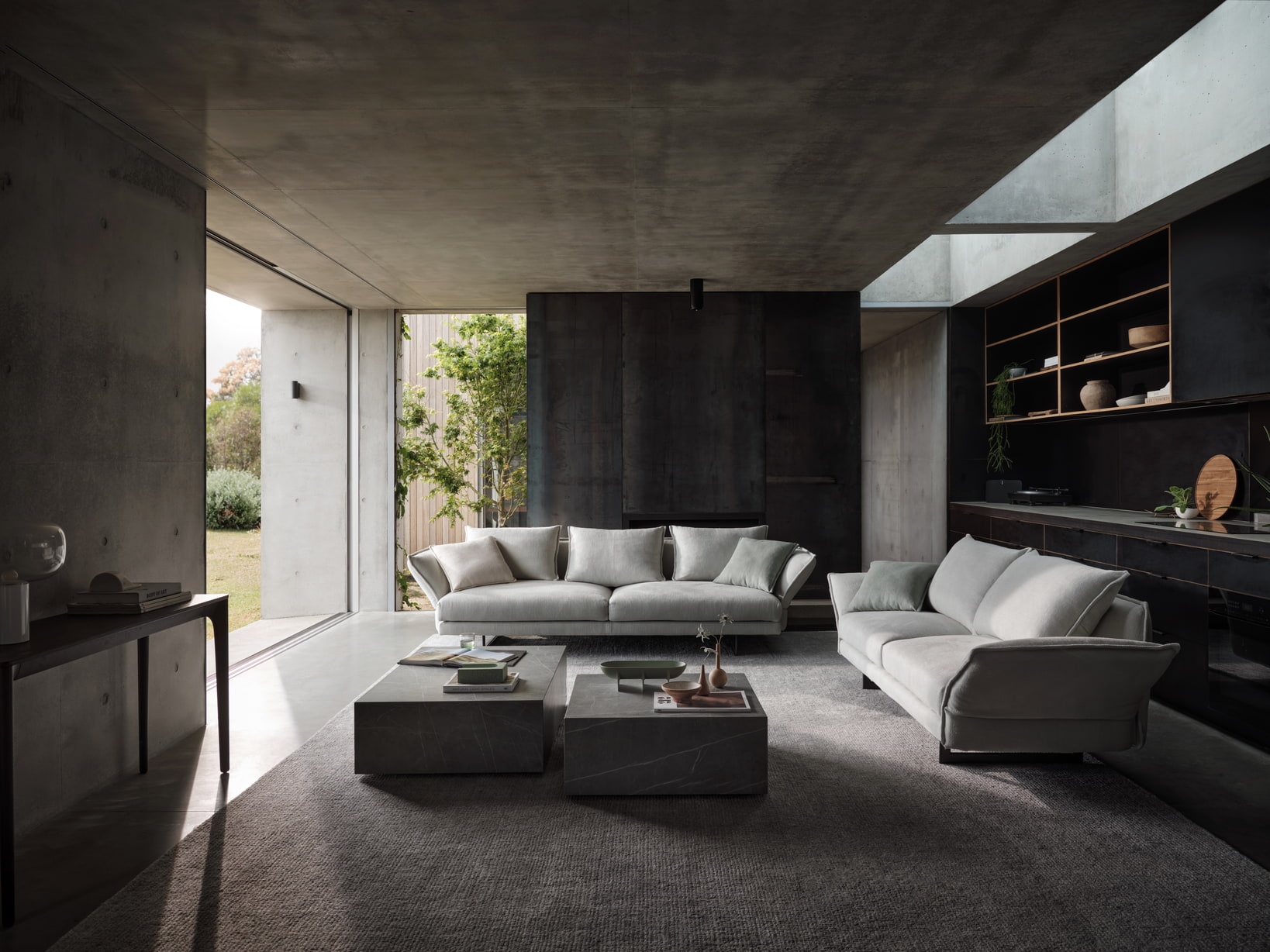
Zaza in Hamilton Cool Mint.
The sofa defines the space
Next came the sofa, arguably one of the most important items of furniture in any home, and the piece that will define the mood of a living space. Like most areas of our home, the open-plan living/dining contrasts vintage and contemporary (interestingly, many of the key items in our country home also served us in our previous, industrial-style city apartment) and embraces uninterrupted views across wooded hills. Our three-seater Zaza sofa in Positano Silver, designed in collaboration with Charles Wilson, is the perfect choice for our aesthetic and our lifestyle. It’s as comfortable for a casual night in with Netflix as it is for a formal photoshoot. And yes, our canine family loves our Zaza too. But choosing it was a tough call; the Jasper II, Bellaire (always reminds me of my favourite mid-century period) and Plaza sofas would all have worked perfectly in our space too.
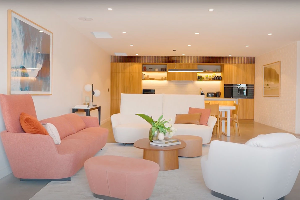
The Fleur Sofa paired with the Fleur Ottoman, Fleur Lounge Chair and Issho Coffee Table.
Comfort and personality
With sofa and rug chosen, the basic palette was set, and we could consider other elements to build comfort and personality. As the only indoor living area in our home (we also have generous outdoor decks at the front and rear), ours needed to feel both relaxed and formal, contemporary and classic. We decided to keep things neutral but layered, with decorative detail and colour supplied by soft furnishings, a gallery-style art collection and those magnificent views that create an ever-changing, seasonal mural.
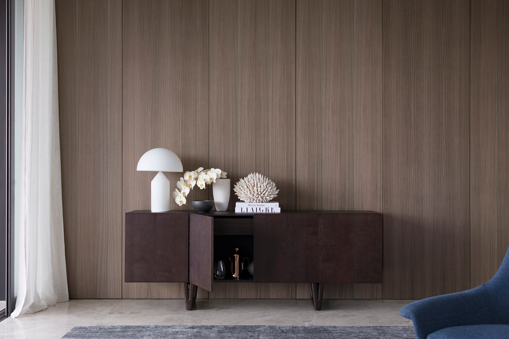
Aspen Four-Door Sideboard in Smoked Oak.
Warmth and ambience come from numerous lamps at different heights and a wall-mounted fireplace. Only our sofa and credenza (I currently have my eye on the Aspen Four-Door Sideboard in Smoked Oak) are positioned against the walls. Other chairs are positioned more centrally – on the rug, of course - to create a sense of space. Chairs that would work beautifully in our space are the Seymour Swivel Armchair (NuTouch Eucalyptus Leather please), Charles Wilson’s Luna Chair (that lovely mid-century vibe again) and the Oliver Tub Chair in Nolan Sago which has a timeless, Deco-inspired elegance.
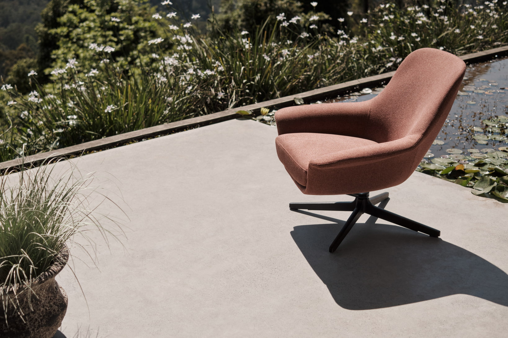
Seymour Low Swivel Armchair in Byron Russet.
Ours is not a big living space, but the neutral palette, abundant light, and furniture choices allow it to punch well above its weight. It feels spacious, and with soft, floor-to-ceiling Belgian linen sheers to filter the harsh summer light, the space feels cool and airy in summer, cosy and intimate in winter. The Eto Marble Coffee Table, designed for King by Tom Fereday, adds a final flourish that is as luxurious in its choice of materials as it is understated in style.
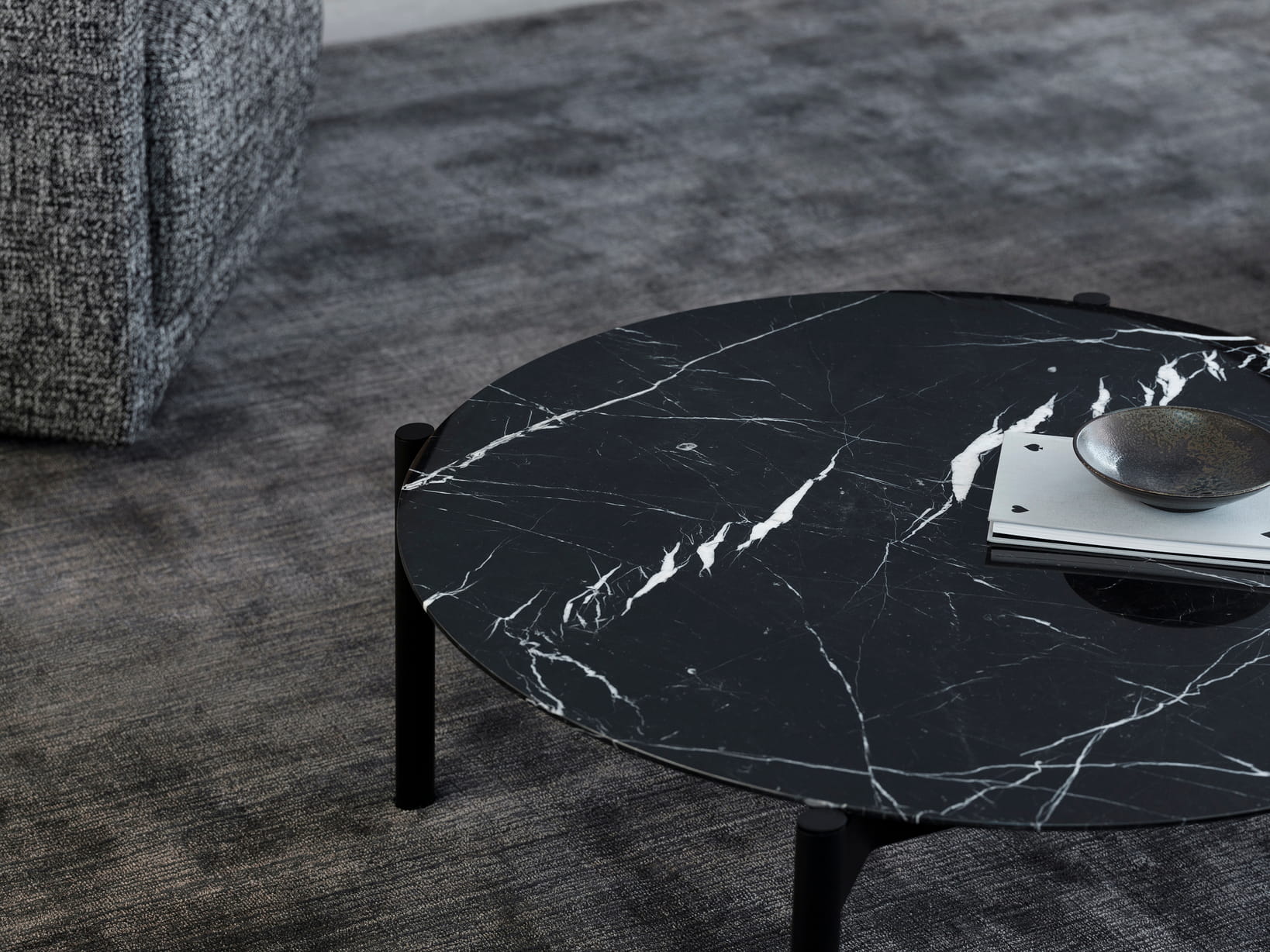
Eto Marble Coffee Table in Nero Marquina.
When David and I moved into the house, we knew we wanted to live in a modern country home that respected history and location without feeling like a museum. And with a growing family of dogs, nor could it be precious. We also knew that what had worked in our city home would work just as well in the country, because it was the next artwork to be created, the next chapter in the same story – ours.
If you would like to curate your signature living space with the KING Designs, you can visit your nearest KING Showroom or you shop online.
For more inspiration and exclusive interior design advice, discover:
- Neale Whitaker on the art of living well
- Neale Whitaker on the art of the outdoor room
- Neale Whitaker on creating a connected dining space
- Neale Whitaker on creating the perfect bedroom sanctuary
- Neale Whitaker’s guide to living with rugs


